New Concept - (Not) Impossible!


I got a mail from a family with two grown-up children. The older son is starting a family of his own so he has moved out some time ago. Younger son is at college, and comes home for holidays, so his bedroom could also be used as a guest room. Parents wanted to make some changes now they will have more time for themselves. They don’t need three bedrooms, but bigger living room with more light. They also want bigger dining space for friends and family gatherings.

PREVIOUS STATE

The big foyer was without any daylight and the living room had only one window. Dining was by the small kitchen and to distant from the living room. There was a long corridor to the three bedrooms. Master bedroom was small, and the apartment had only one bath tub.


RECOMMENDED SOLUTION


FUNCTION

To change anything for the better at first seemed like an impossible mission. 

The entrance was positioned at the corner of the apartment, so the corridors were inevitable. Living room needed more light so the only solution was to join two smaller bedrooms to get spacious living room. But then there would be no connection to the kitchen! The lavatory was on our way. 

Then I got the idea - if only we could make a passage through the lavatory wall! 

That needed some engagements from the investors since they had no original plumbing and ventilation plans. They called a plumber who made a small opening above the lavatory sink to see if the sewage or ventilation blocks were on our way. He examined the inside of the installation block and gave positive opinion. We could make an opening/door about 80cm wide, with only small intervention with one water supply pipe. 

And then everything began to take it’s place…


INSPIRATION


Living room:

Honey-color of Cerruti Baleri couch with glossy steel-bars and elegant lines stand out against the white surface. The brick wall texture and terracotta color support the warm atmosphere.


Bedroom:

Cozy corner by the window in the bedroom. Keep it light but warm with Scandinavian sense for wood.


Kitchen:

White kitchen counters and beautiful glossy wood on the cupboard doors reflect the light. Add two bar stools by the window and enjoy a quick snack.


Images: Cerruti BaleriBo BedreAlno


Squeeze in an Extra Room, Please!


This apartment is the home of a young couple with a little daughter. 
She will soon begin to go to school so she’ll need a room of her own. 
I’ve tried to make her wish true… 


PREVIOUS STATE


RECOMMENDED SOLUTION


INSPIRATION


 Jesse - Martin white sopha

 Jesse - Tullybed


CONSTRUCTION AND CRAFTWORK


These are the walls which have to be removed (orange) and the new walls (green


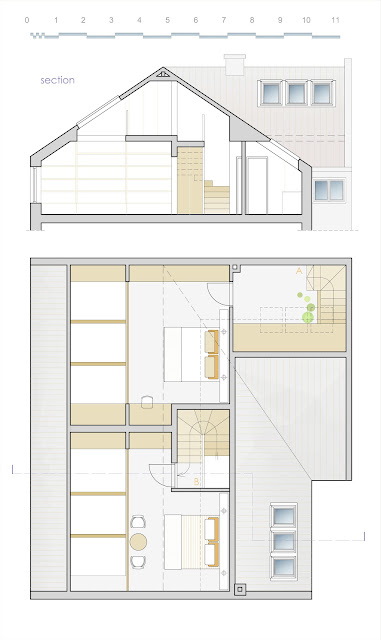
Loft Design - Bring It to the Upper Level


Two sisters have inherited the house with two loft apartments. 
They have discovered the attic space which was left unused.They got a great idea - to expand the apartments and make bedrooms at the upper level...


PREVIOUS STATE


RECOMMENDED SOLUTION - LOWER LEVEL

 INSPIRATION

 Photo by Loft Life magazine


RECOMMENDED SOLUTION - UPPER LEVEL


INSPIRATION
  

Kitchen Design

High technology, simplicity of form, pure and essential lines - are the main features of a modern kitchen in a luxury, open-plan apartment.


 DESIGN DETAILS


1)        WALL ELEMENT

            Cabinet with three doors, and two vertical boards and three shelves inside.
            Doors are a bit indented from the edge. There is the mirror at the door front. All doors open around upper horizontal axis. At the bottom edge of the doors aluminium or inox battens are attached instead of the door handles.

2)        Open SHELF.

3)        LOWER CABINETS

            Countertop with built-in kitchen sink.
            Deep drawers for dish storage. At the upper edge - aluminium batten.
            Cabinets are elevated on aluminium legs.


KITCHEN ISLAND

           Part  A  - facing the dining table - should be little higher than the countertop - as a kind of visual barrier. It is also used for plates and cutlery storage. There are four doors ( A1 - A4 ) at the upper part which open around the horizontal axis. Lower part has two storage spaces ( A5 - A6 ).            
Part  B  - with work surface - is lower and has built-in cooktop. Under the countertop there are three drawers ( B1 - B3 ) and a storage space ( B4 ). The most part of the front is open and there is room for two bar-stools.


 Are you thinking about kitchen redesign? Need any help about the design? Contact me!

Feel free to post any questions or comments.

Small Lavatory Design

  
Lavatory near the home entrance should be considered to be 
the expansion of the hall rather than only a sanitary facilities...


INSPIRATION


Small Bathroom Design


Family D. wants to rearrange small bathroom which will be shared by their two kids - a daughter and a son.
They ask if there is any chance of finding some space for a washer.
 
PREVIOUS STATE


RECOMMENDED SOLUTION


 Tiles by FAP CHERAMICHE


Bathroom Inspiration

 I showed you the redesign of the duplex upper floor and the images of the master bedroom.

We can now look inside the lavatory and the bathroom...


Mirror and wooden console counter with two over-counter basins run along one wall.


Bathroom with hydro-massage bath and a shower cabin.


View from the shower cabin.


Duplex Apartment - Master Bedroom Visualizations

Pictures of master bedroom of the duplex apartment from the previous posts.


Morning light from bed:
wall on the right is covered with tiles that have bronze reflection.


Entrance view:
on the left - glass shelves in the niche illuminated from above.
Wooden panels on the floor.


Suspended ceiling with built-in lighting which continues into stylized head of the bed with open or hidden shelves...


Standing at the entrance of the wardrobe corridor.
Mirrored doors visually widen-up the space.
Lavatory on the right with bronze tiles on the walls.


Duplex Apartment Luxury Design - Upper Level


This is the upper level of the duplex apartment from the previous post...

Newly wedded couple bought this duplex in high rise while it was still under construction. The apartment had a beautiful view being located on 11th and 12th storey and a lot of potential considering it’s size (220 m²). But it didn’t quite satisfy their way of life and future plans.


UPPER LEVEL - PREVIOUS STATE


There were four bedrooms and only one bathroom provided by the original design. One bedroom was a bit spoiled with a badly positioned column.


UPPER LEVEL - RECOMMENDED SOLUTION


FUNCTION


Tenants had a demand for one master bedroom and two smaller rooms which will in time change the purpose.
 
The master bedroom is located at the best position – by the big loggia. Now it has a bathroom of it’s own, with a lavatory designed to be a part of the room - without doors, hidden only by a wardrobe wall. Lavatory has long wooden countertop console with two over counter basins. Wardrobe is a free-standing element with walls on three sides facing the bedroom and mirrored doors facing the lavatory. The bathroom - as a more intimate zone is isolated and luxurious, with a Jacuzzi tub and a shower.
 
There was a possibility to insert one more bathroom between two smaller rooms because installations vertical was already there, next to the column. So what was an eyesore became a shower screen with a niche. There is also a laundry space by the window.
 
Smaller rooms have wide window surfaces which open the view towards sky. One room has the entrance to the loggia and the other has a changing room attached. 


CONSTRUCTION AND CRAFTWORK


Most of the walls from the previous plan will not be kept. These are the walls (green) which had to be removed:


Here are the new (red) walls: